April 17, 2014,
 Consumer behaviour, Guru in a Bottle
  No comments

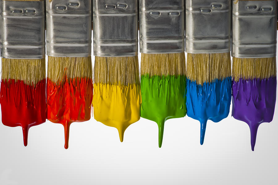 The choice of colour has become one of the single most important elements in creating a brand. I remember having a conversation about this over lunch with a very good friend and mentor of mine, Wally Olins CBE, who sadly passed away this week at the age of 83.
Wally was an extraordinary person in many ways and was in fact the first person in the UK to have launched a brand consultancy back in the 60s.
Wally understood – perhaps more than any other person of his generation – that branding is intrinsically linked with colour.
It was something he felt passionate about and when asked to create a new mobile phone brand by Hutchinson Telecom after its acquisition of a controlling stake in Microtel Communications in the early 90s, Wally is credited with having created Orange, one of the most iconic and commercially successful brands of the past 50 years.
 After selling his phenomenally successful branding agency Wolff Olins in the late 90s, Wally launched Saffron Brand Consultants that continues to produce the kind of work that made him such a towering figure in the world of brand design.
In many respects Wally was always ahead of his time. The use of colour with shape and form can alter mood and affect the behaviour of people in a powerful and very personal way.
It plays a major role in our visual perception and therefore a fundamental grasp of colour perception in graphic and web design is critical in order to create a palette that evokes the audience reaction we desire.
A few years’ ago I had the privilege to work with one of my other heroes, Dr Edward de Bono, the grandfather of lateral thinking and helped to launch his book Think! Before It’s too Late.
I recall the book launch was unlike any other as Edward de Bono hosted lunch for a cross-section of some remarkable people from all walks of life at the River Terrace at the House of Lords, London.
Both creative and fiercely mathematical, Edward de Bono was something of an enigma. No one on the planet could have conceived of the most powerful lateral thinking tool ever created – Six Thinking Hats – except him.
Edward de Bono conceived of a way in which we can solve problems – in fact any problem – by ‘wearing’ different coloured hats that had the power to break the habit of linear thinking or critical analysis that we tend to default to as a result of our narrowly constructed education experience here in the Western Hemisphere.
‘Six Thinking Hats’ is a lateral thinking process that frees us to think much more creatively about how a solution could look like.
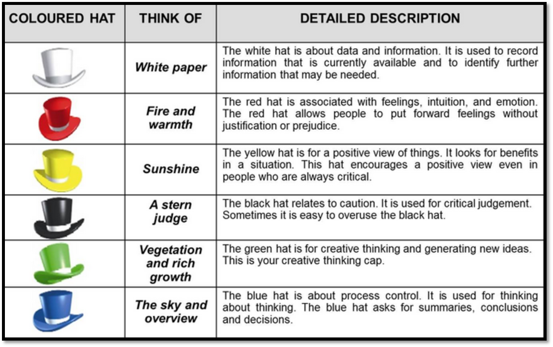 As Edward told me, he wanted to teach people to ‘think about thinking’ – something that as a society we tended to undervalue as we cram young minds full of subjects in the hope that the pupil will attain a high pass mark rather than provide them with the tools to problem solve for themselves as their cognitive powers develop.
And it was the power of colour as a way to help move our thinking and ultimately influence behaviour that’s an interesting aspect of Dr Edward de Bono’s work.
In the fast-paced and ever changing market place and as a result of social media that increasingly engages with customer segments in a visual way, marketers need to start to think about the power of colour.
Research shows that our brains are wired to associate specific feelings with certain colours.
 Most of us are aware that colours can evoke certain emotions, but it may surprise you to learn that colour accounts for 60% of a person’s acceptance or rejection of another person or object and over 92% of people are more heavily influenced by the visual dimension than say taste, smell, touch and sound and that full-colour advertising has a 26% higher recall than ads in black and white.
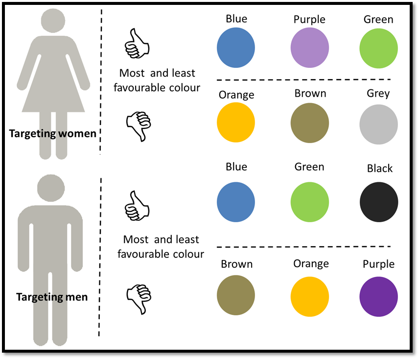
A challenge for marketers is that different colours convey different meaning. This meaning can be of two major types: natural associations and psychological or cultural associations.
Natural association stands for colours that bring to mind certain ideas generally registered by everyone and are universal in nature. Like associating green with nature and trees, yellow with sun and blue with the sky.
Psychological or cultural associations are different for different part of the world and reflect varied culture. For example, black is associated with death in the West and yet white is often associated with death in other parts of the world, including India.
Then add to this various hues and other associated text and verbal cues and all of these variables combine to determine how a brand is received and perceived.
 From a medical perspective, marketers may want to gravitate towards the colour red. There are three groups of colour receptors in the back of our eyeball: for red, green and for blue.
We have on average greater amount of red colour receptors and as a result red is the colour most easily seen also under unfavourable light conditions. It’s one reason why warning signs and the ‘stop’ light are red.
Most fast food restaurants are often decorated with vibrant colours like reds and oranges as research shows that such colours encourages diners to eat quickly and leave, allowing the restaurant to increase its footfall and customer churn that increases its turnover and profitability.
At the other end of the scale, up-market restaurants often favour blue as this creates a calming and relaxing effect on its diners, prolonging the length of the meal and increasing the amount of food and drink ordered.
Blue remains the number one colour used by businesses in Europe, Asia and North America; although to stand out from the crowd marketers may decide that a more radical colour other than blue is required.
Wally showed how this could be done when he created Orange.
Toys, books and children’s web sites tend to use basic primary colours because research shows that children prefer these colours and respond to these positively than any other pastel shades.
In India, red is symbolic of strength and purity and is associated with best-selling Lifebuoy and Eveready brands.
 The science of the power of colour is still in its infancy compared with other marketing disciplines and is an area where more research is required. But major brand owners are in the vanguard in understanding how colour can increase brand recognition.
For example, Heinz introduced a tomato ketchup variant – Heinz EZ Squirt Blastin’ Green ketchup that achieved 10m sales generating more than $23m in seven months of its launch, making it the highest increase in sales in the brand’s history.
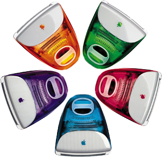 And in happier times, Apple famously launched a new range of iMacs into an otherwise homogenous market under the tag “It doesn’t have to be beige” which helped to rejuvenate a brand that had been haemorrhaging $1.8bn in cash just two years earlier.
Ultimately, marketers need to be aware that colours evoke certain feelings towards the brand so it’s vital to choose colours that represent your identity effectively.
By choosing a colour or a combination of colours is important in getting your message across. The art of influencing and selling increasingly depends on visual cues – the strongest and most persuasive being colour.


Recent Comments